|
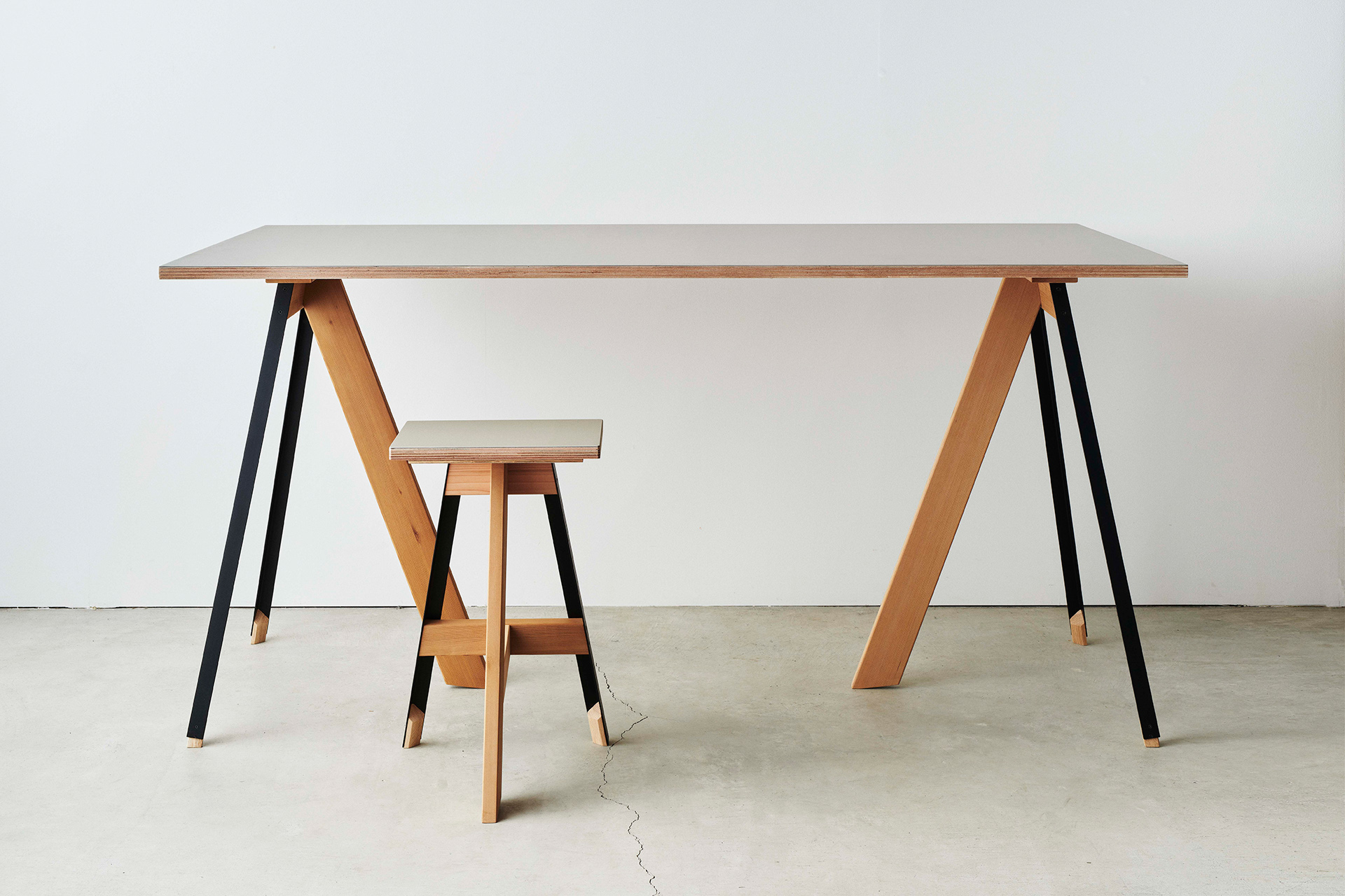
| The principles of design are a set of guidelines that help artists and designers create visually appealing and effective compositions. |
Welcome to Design 101: Mastering the Principles of Great Design! This website is dedicated to helping you develop the skills and knowledge you need to create effective and visually appealing designs. Whether you are a graphic designer, web designer, artist, or just interested in learning more about design principles, this resource is for you.
Throughout this website, we will explore the fundamental principles of design, including balance, contrast, emphasis, unity, proportion, movement, rhythm, and harmony. Each principle is explained in detail, with examples and practical tips for applying it to your own work.
We will also cover important design concepts, such as color theory, typography, and composition, and provide insights into the design process, from brainstorming and sketching to prototyping and finalizing your work.
By the end of this course, you will have a solid understanding of the principles and techniques that make great design, and be able to apply these skills to a wide range of design projects. So let's get started on our journey to mastering the principles of great design!
Principles of Design
The principles of design are a set of guidelines that help artists and designers create visually appealing and effective compositions.
Here are some of the most commonly recognized principles of design:
- Balance: The visual weight of elements in a composition should be distributed evenly to create a sense of balance. This can be achieved through symmetrical or asymmetrical arrangements of shapes, colors, and other design elements.
- Contrast: Contrast creates visual interest by juxtaposing different elements. It can be achieved through variations in color, texture, shape, size, or other attributes.
- Emphasis: Emphasis draws attention to a specific element in a composition. It can be achieved through size, color, contrast, or placement.
- Unity: Unity refers to the coherence and harmony of a composition. It can be achieved through repetition, consistency of style, and the use of a limited color palette.
- Proportion: Proportion refers to the relationship between different elements in a composition. It can be used to create a sense of scale, depth, and perspective.
- Movement: Movement creates a sense of motion and direction in a composition. It can be achieved through the use of diagonal lines, implied motion, or the arrangement of elements in a specific pattern.
- Rhythm: Rhythm refers to the repetition of elements in a composition. It can be used to create a sense of flow and continuity.
- Harmony: Harmony refers to the use of similar elements in a composition. It can be used to create a sense of consistency and balance.
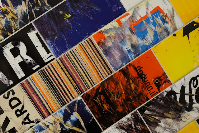 |
| The principles of design can be applied to a wide range of creative fields, including graphic design, web design, fashion design, interior design, architecture, product design, and art. |
Where we can use Principles of Design?
The principles of design can be applied to a wide range of creative fields, including graphic design, web design, fashion design, interior design, architecture, product design, and art. Here are some specific examples of where you can use these principles:
- Graphic design: The principles of design are essential for creating effective and visually appealing graphics, such as logos, posters, brochures, and advertisements.
- Web design: Design principles are crucial for creating user-friendly and visually appealing websites. Balance, contrast, and emphasis can be used to guide the user's eye and highlight important information, while unity and rhythm can create a consistent and cohesive design.
- Fashion design: Design principles are important for creating clothing and accessories that are both functional and aesthetically pleasing. Proportion, balance, and contrast can be used to create visually interesting and flattering silhouettes, while harmony can create a cohesive collection.
- Interior design: The principles of design are essential for creating functional and visually appealing interior spaces. Proportion, balance, and harmony can be used to create a comfortable and cohesive living space, while contrast and emphasis can create visual interest.
- Art: Design principles are important for creating compelling and visually engaging artwork. Rhythm, contrast, and emphasis can be used to create dynamic compositions, while unity and harmony can create a cohesive and balanced piece.
Principles of Design: 01 Balance
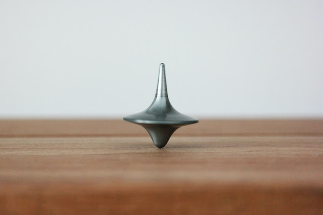 |
| Balance is a fundamental principle of design that refers to the distribution of visual weight in a composition. |
Balance is a fundamental principle of design that refers to the distribution of visual weight in a composition. A balanced design feels stable and harmonious, while an unbalanced design can feel off-kilter or chaotic. There are two types of balance in design:
- Symmetrical balance: This occurs when a design is mirrored or evenly divided along a central axis. Each half of the design is a mirror image of the other, creating a sense of stability and formality.
- Asymmetrical balance: This occurs when a design is balanced through the careful distribution of different visual elements. Asymmetrical balance can create a more dynamic and visually interesting composition, as long as the weight of each element is carefully considered.
Balance can be achieved through the careful use of color, shape, size, and other design elements. By understanding how to balance a composition, designers can create designs that are both visually appealing and effective at communicating their intended message.
Principles of Design: 02 Contrast
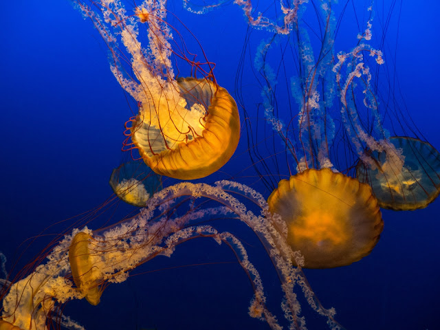 |
| Contrast is a principle of design that refers to the juxtaposition of different elements in a composition. |
Contrast is a principle of design that refers to the juxtaposition of different elements in a composition. By creating contrasts between different elements, designers can create visual interest and add depth and texture to their work. There are several types of contrast in design, including:
- Color contrast: This occurs when different colors are used in a composition. High contrast colors, such as black and white, create a bold and dramatic effect, while low contrast colors, such as pastels, create a more subtle and muted effect.
- Texture contrast: This occurs when different textures are used in a composition. Smooth and rough textures can be used to create a sense of depth and dimension in a design.
- Shape contrast: This occurs when different shapes are used in a composition. Geometric shapes, such as squares and circles, create a sense of structure and order, while organic shapes, such as those found in nature, create a more fluid and dynamic effect.
Contrast can be used to highlight important information, create visual hierarchy, and add interest to a composition. By carefully considering the use of contrast in their work, designers can create designs that are both visually appealing and effective at communicating their intended message.
Principles of Design: 03 Emphasis
Emphasis is a principle of design that refers to the visual weight or importance given to a particular element or area in a composition. By creating emphasis, designers can guide the viewer's eye and create hierarchy in their design. There are several ways to create emphasis in a design, including:
- Size: Making an element larger than others in a composition can create visual emphasis and draw the viewer's eye to that area.
- Color: Using bright or bold colors can create emphasis and draw attention to a particular element.
- Contrast: Creating contrast between elements in a composition can highlight important information and create visual interest.
- Placement: Placing an element in a prominent position within a composition can create emphasis and draw attention to that area.
By using emphasis effectively, designers can create designs that are both visually engaging and effective at communicating their intended message. It can also help ensure that important information is noticed and remembered by viewers.
Principles of Design: 04 Unity
Unity is a principle of design that refers to the visual coherence and harmony of a composition. A design that has unity feels like it belongs together and has a consistent overall look and feel. Unity can be achieved by creating visual connections between different elements in a composition. There are several ways to create unity in a design, including:
- Repetition: Repeating visual elements, such as colors, shapes, or patterns, can create a sense of unity in a design.
- Proximity: Placing related elements close to each other in a composition can create a sense of unity and help to visually group information.
- Continuation: Using a particular visual element throughout a composition can create a sense of unity and help to tie different elements together.
- Alignment: Aligning different elements within a composition can create a sense of unity and help to create a cohesive overall design.
By creating unity in their designs, designers can ensure that their work is visually appealing and easy to understand. It can also help to create a consistent brand identity and ensure that all design elements are working together to communicate a clear message.
Principles of Design: 05 Proportion
Proportion is a principle of design that refers to the size and scale of different elements in a composition in relation to each other. By using proportion effectively, designers can create a sense of balance and harmony in their work. There are several ways to use proportion in a design, including:
- Golden Ratio: This is a mathematical concept that has been used in design and art for centuries. It involves using a ratio of approximately 1:1.618 to create visually pleasing proportions in a composition.
- Scale: Using different scales for different elements in a composition can create a sense of depth and visual interest.
- Crop: Cropping an image or design element can create a sense of proportion and highlight certain areas of the composition.
- Negative Space: The use of negative space in a design can create a sense of proportion and balance between different elements.
By using proportion effectively, designers can create designs that feel visually pleasing and balanced. It can also help to create a sense of hierarchy in a composition and guide the viewer's eye towards important information.
Principles of Design: 06 Movement
 |
| Movement is a principle of design that refers to the way the eye moves through a composition. |
Movement is a principle of design that refers to the way the eye moves through a composition. By creating movement in a design, designers can guide the viewer's eye and create a sense of flow and direction. There are several ways to create movement in a design, including:
- Lines: The use of diagonal or curved lines can create a sense of movement and guide the viewer's eye through a composition.
- Repeating Patterns: Using repeating patterns can create a sense of movement and rhythm in a design.
- Directional Cues: Placing elements in a certain direction, such as a person looking off the page or an arrow pointing in a certain direction, can create a sense of movement and guide the viewer's eye in a specific direction.
- Animation: In digital design, animation can be used to create movement and bring a design to life.
By creating movement in a design, designers can create a sense of energy and excitement, as well as guide the viewer's eye through a composition in a way that communicates the intended message.
Principles of Design: 07 Rhythm
 |
| Rhythm is a principle of design that refers to the repetition of visual elements in a composition. |
Rhythm is a principle of design that refers to the repetition of visual elements in a composition. By creating rhythm in a design, designers can create a sense of movement and flow, as well as add visual interest. There are several ways to create rhythm in a design, including:
- Repetition: Repeating visual elements, such as shapes or colors, can create a sense of rhythm and movement in a composition.
- Alternation: Alternating different visual elements can create a sense of rhythm and create visual interest.
- Progression: Using a series of visual elements that gradually change, such as a series of circles that increase in size, can create a sense of rhythm and movement.
- Gradation: Using a gradual change in color, size, or other visual element can create a sense of rhythm and create visual interest.
By using rhythm effectively, designers can create designs that feel visually dynamic and engaging. It can also help to create a sense of continuity and flow, as well as guide the viewer's eye through a composition in a way that communicates the intended message.
Principles of Design: 08 Harmony
Harmony is a principle of design that refers to the overall sense of unity and balance in a composition. By creating harmony in a design, designers can ensure that all elements work together to create a cohesive and visually appealing whole. There are several ways to create harmony in a design, including:
- Color: Choosing a color palette that works well together and using it consistently throughout a composition can create a sense of harmony.
- Contrast: Using contrast effectively can create a sense of harmony by highlighting certain elements and creating a balanced overall composition.
- Proportion: Using proportion effectively can create a sense of harmony by ensuring that different elements are scaled appropriately in relation to each other.
- Texture: Using texture in a design can create a sense of harmony by adding visual interest and depth.
By creating harmony in a design, designers can create designs that feel visually balanced and unified. It can also help to create a consistent brand identity and ensure that all design elements are working together to communicate a clear message.